Rini Motion Branding
Rini Designs needed more than a logo — it needed a visual language that could move. The goal was to create a motion-first identity where geometry, color, and animation work together across digital touchpoints.
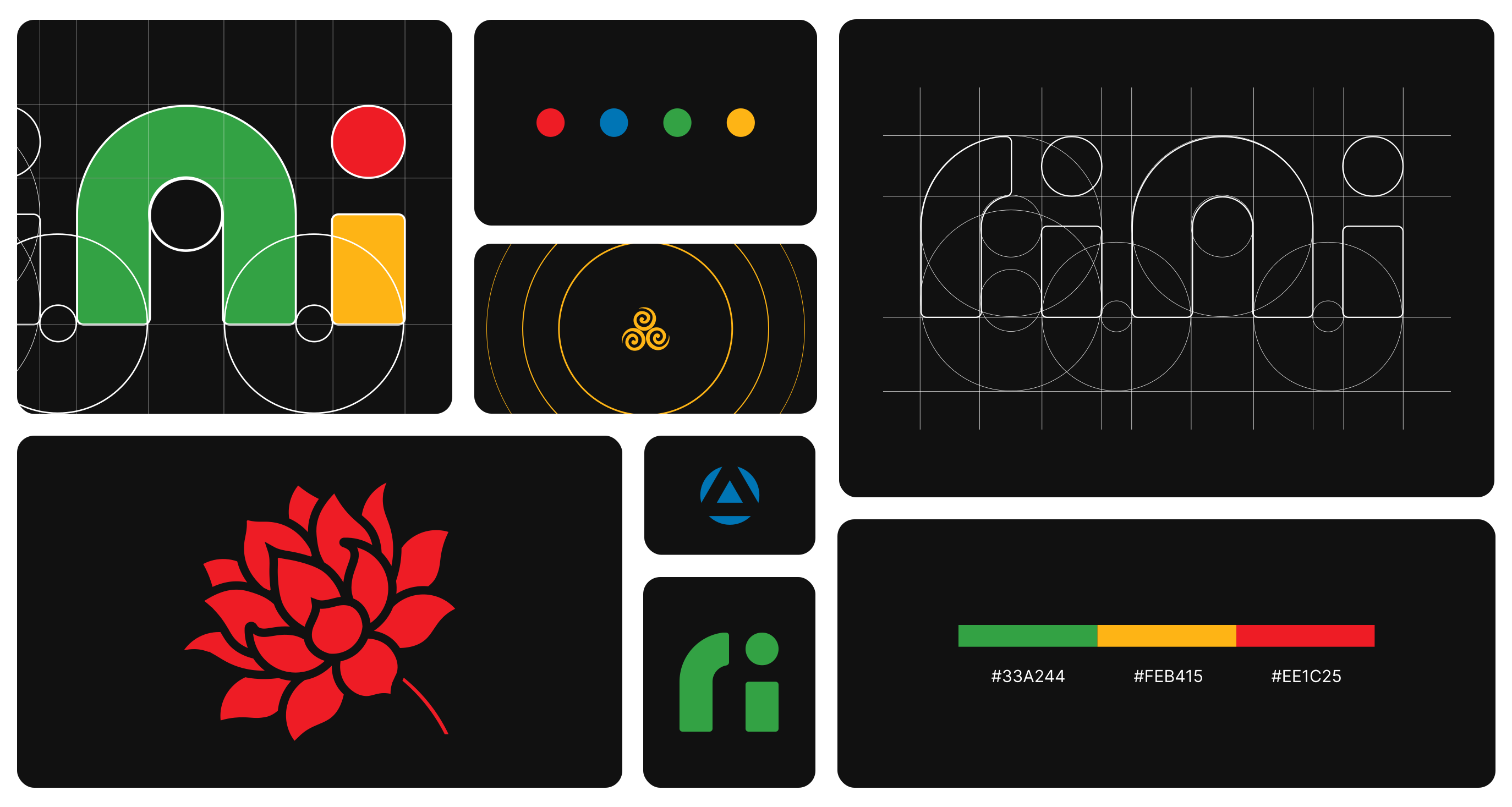
Built on a grid.
The logo is built on a simple geometric grid using circles and rounded forms. Every curve follows a consistent structure, creating a balanced identity that is easy to scale, animate, and reproduce.


A palette with intent.
The palette balances creativity with clarity. Green forms the foundation, while yellow and red introduce energy and contrast. Together, they create a vibrant yet memorable brand system.
Waiting, reimagined.
The loading animation transforms the logo into a seamless looping motion. Instead of hiding waiting time, it reinforces the brand through a simple and recognizable interaction.
From lines to identity.
The motion language grows directly from the logo's geometry. Shapes split, transform, and reconnect using consistent timing, giving the identity a playful yet refined personality.
The identity, in motion.
A short promotional film brings the identity to life by showcasing the logo construction, color system, and motion principles. It introduces the brand through movement rather than static visuals.
Completed in two days, the project delivers a flexible motion branding system that extends beyond a logo — a cohesive visual language for Rini Designs across digital platforms.