Sakura
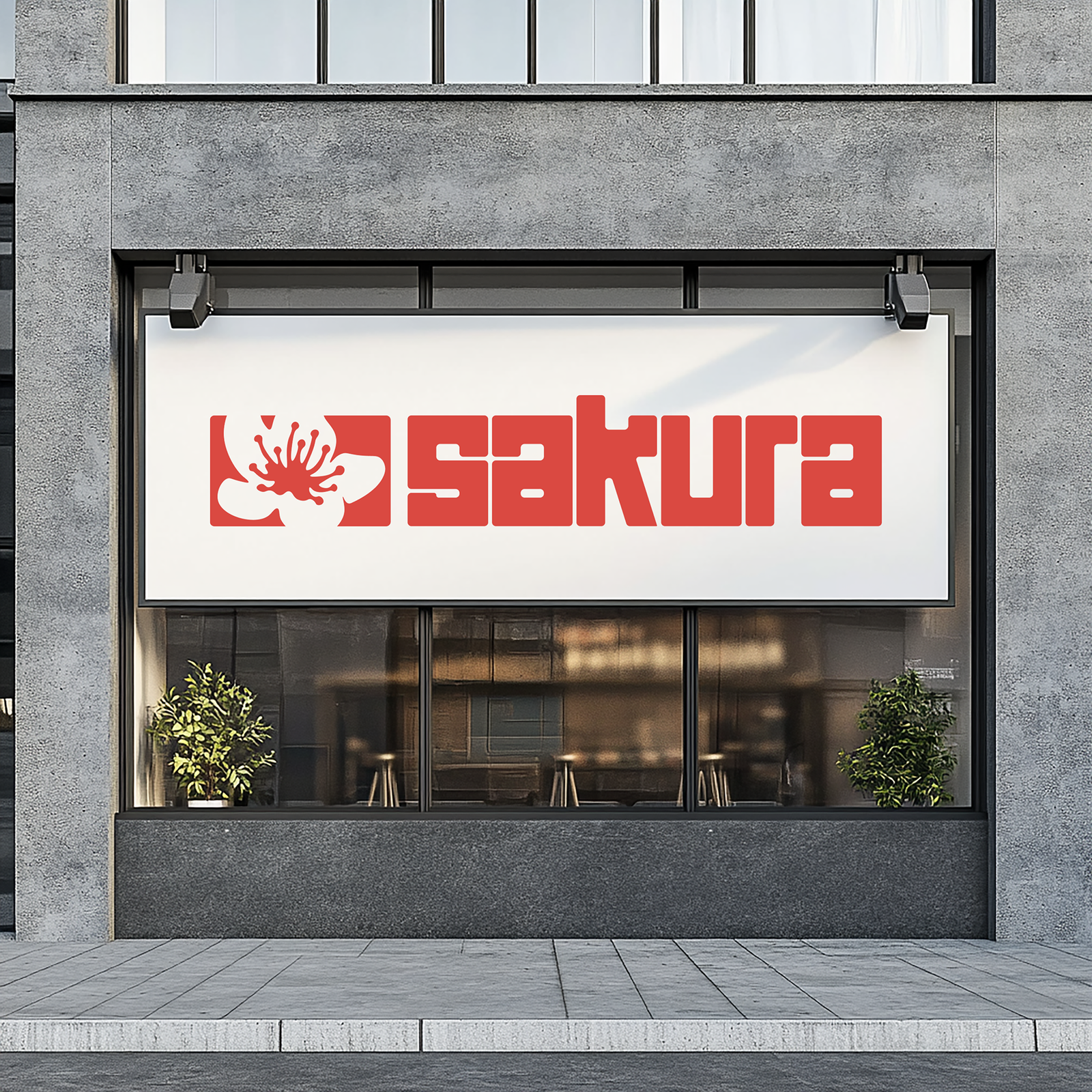
Sakura is a neighborhood supermarket in Sakoli, Maharashtra, branching into its own line of homemade food — starting with dry fruit laddus and peanut chikki. The brief was an identity that could hold up on a retail shelf, travel well on takeaway packaging, and still make sense years from now on the door of a restaurant that doesn't exist yet.
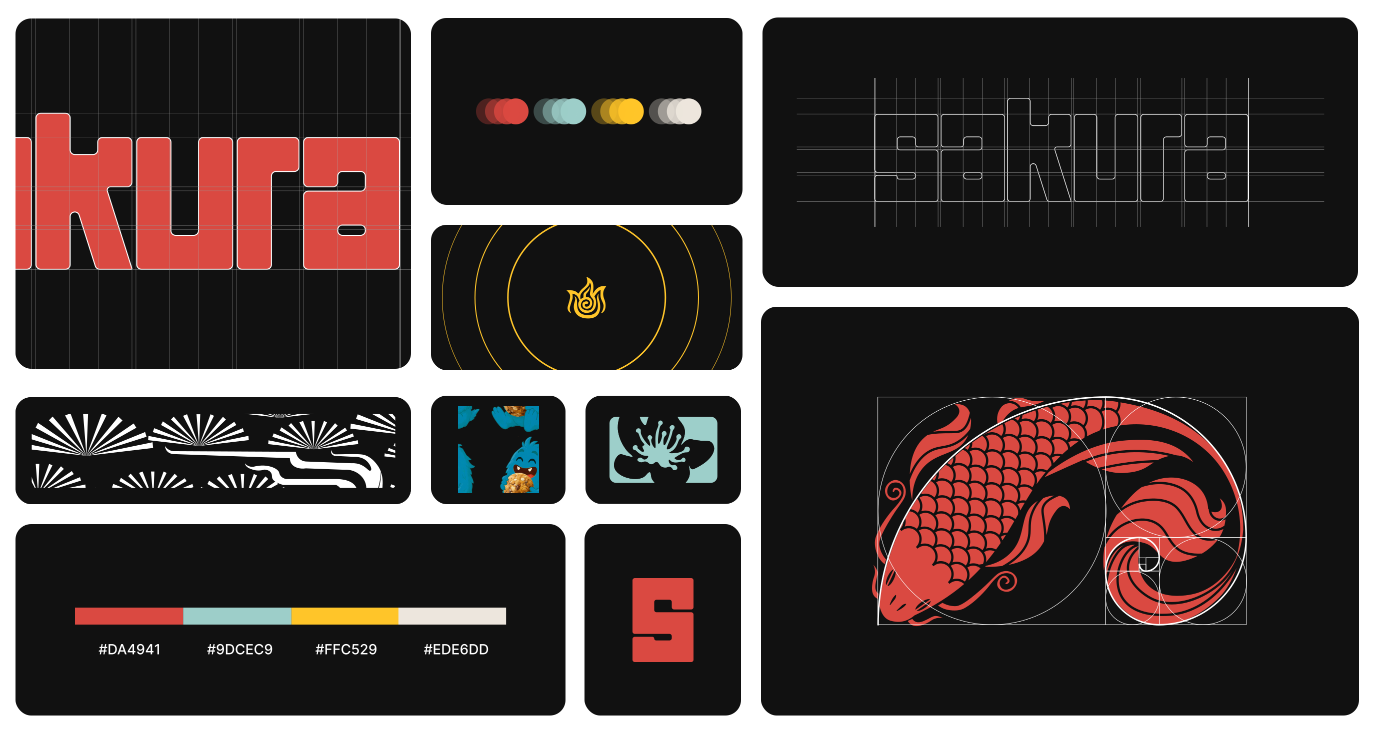
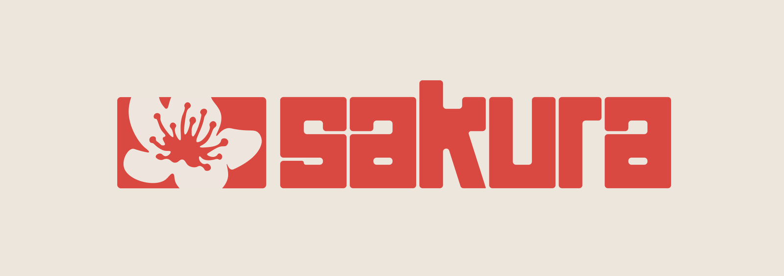
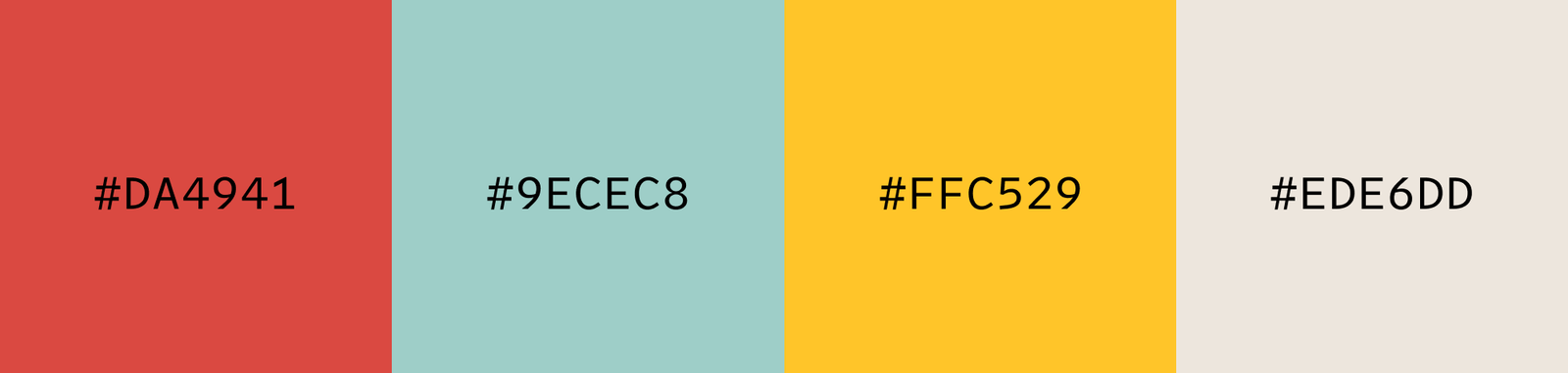
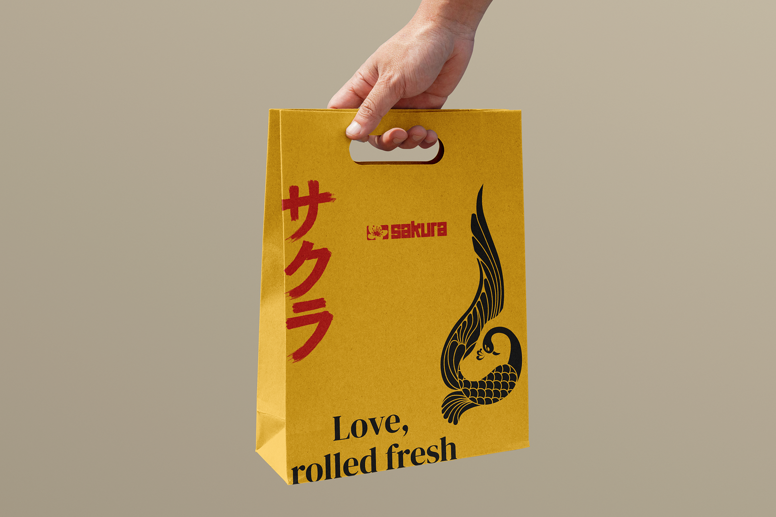
The name comes from the Japanese word for cherry blossom — warmth, beauty, a fresh start. That became the throughline: a friendly mascot, playful illustration, and a clean, contemporary system built to feel premium without losing the warmth of something homemade. From here it extends across logo, packaging for the laddus and chikki, shopping bags, and a menu system ready for whenever the restaurant opens.
The system, piece by piece.
Eighteen touchpoints, shown in sequence — logo, packaging, mascot, and everything that carries the identity from shelf to doorstep.
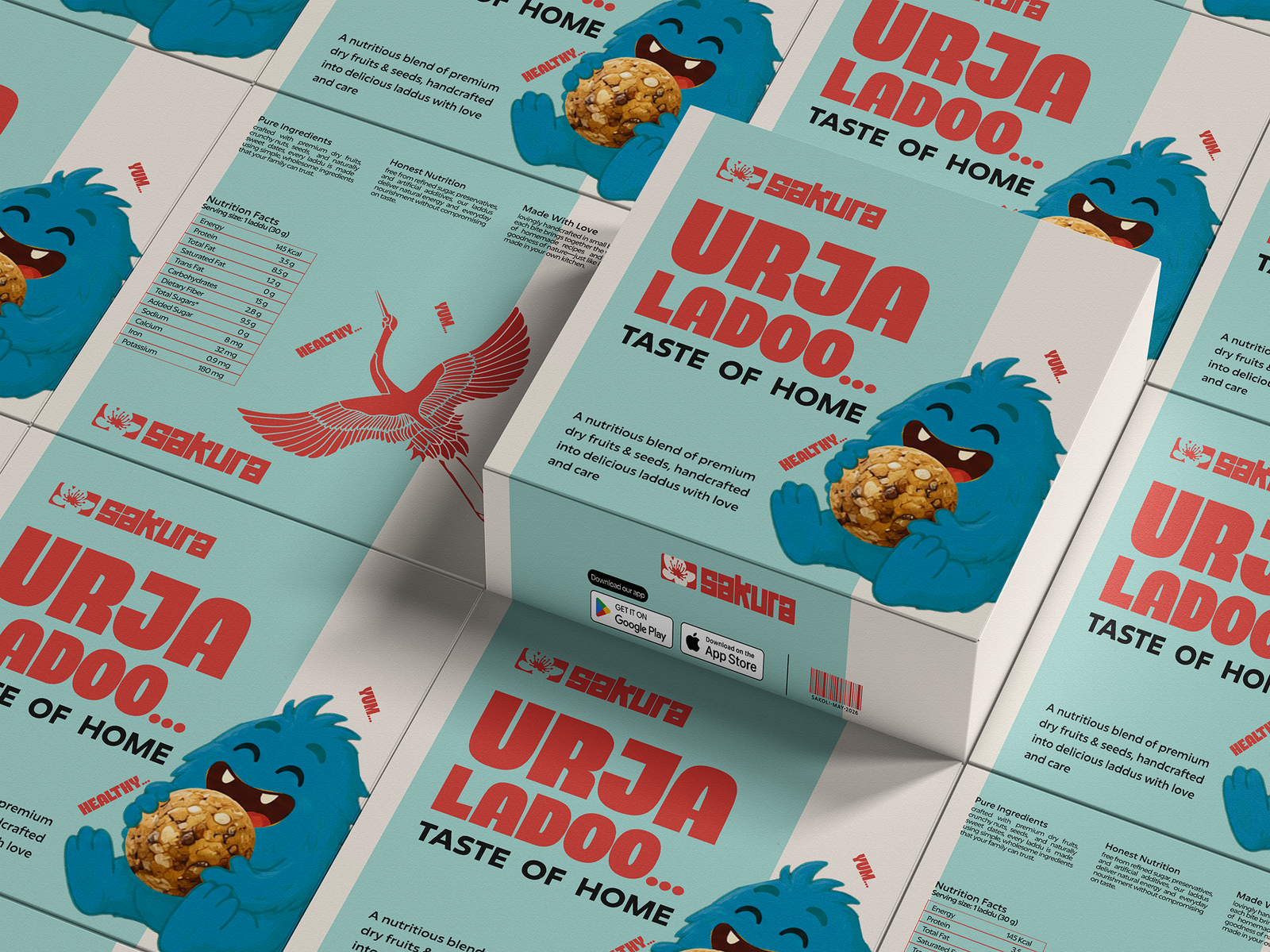

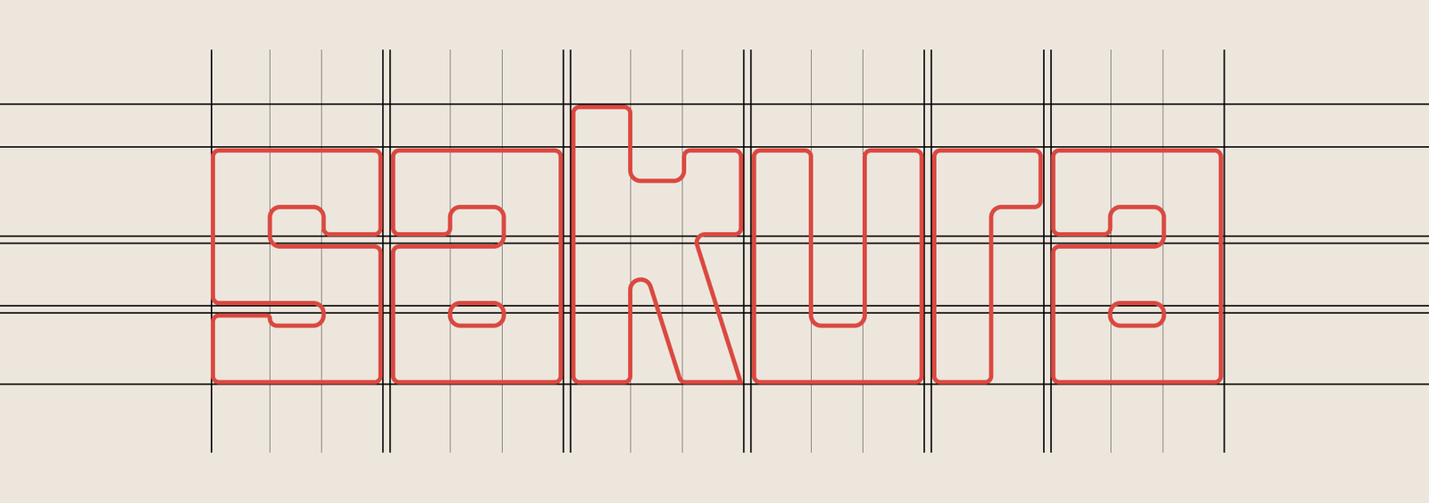
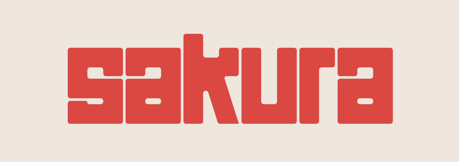
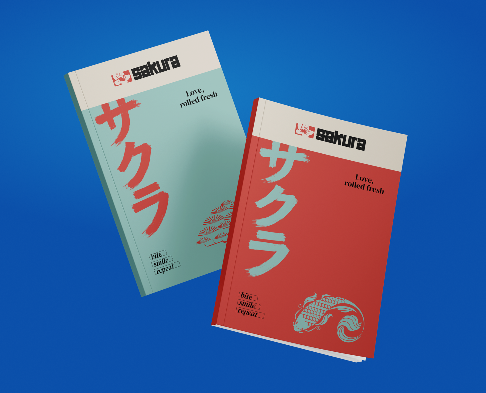
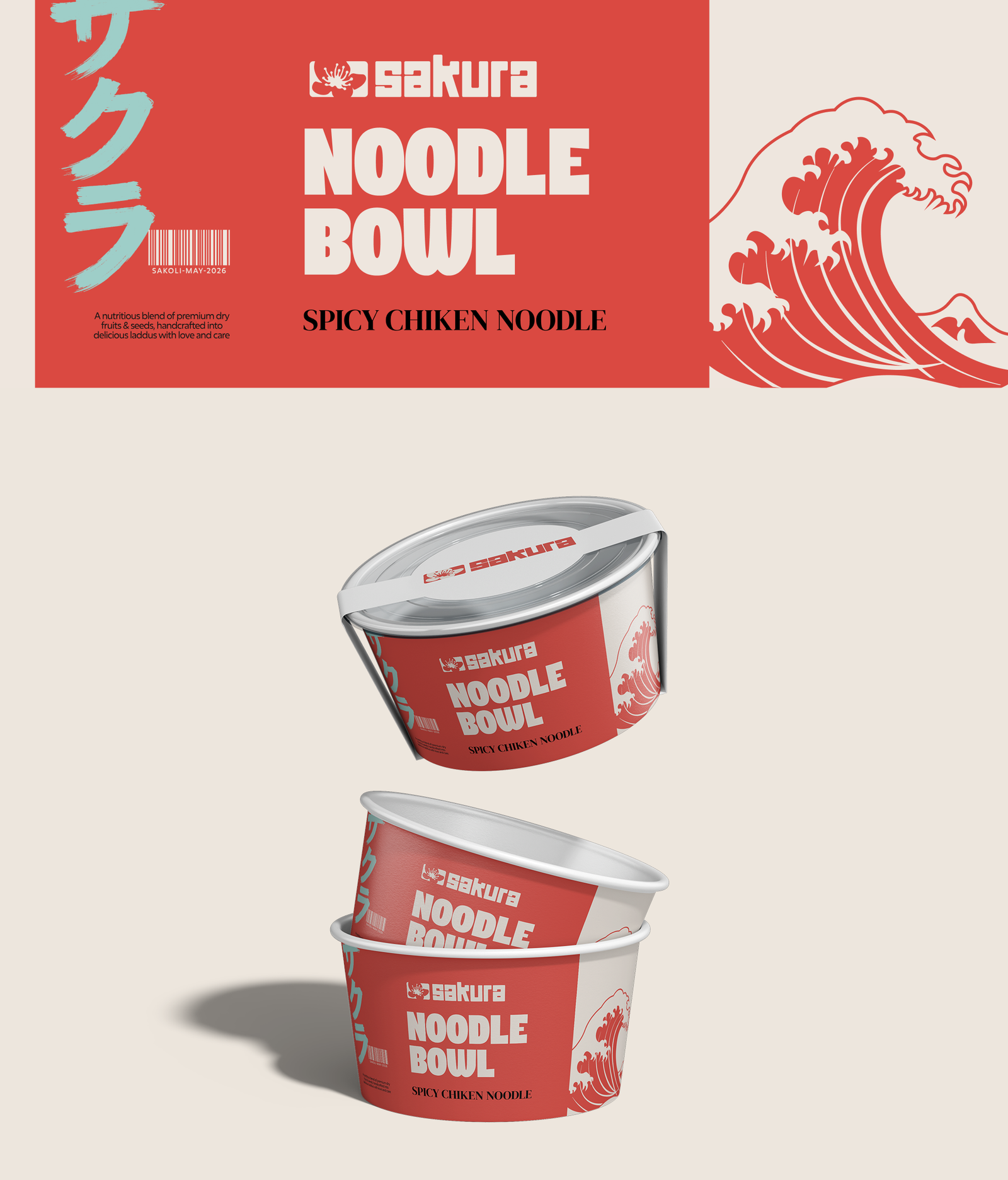
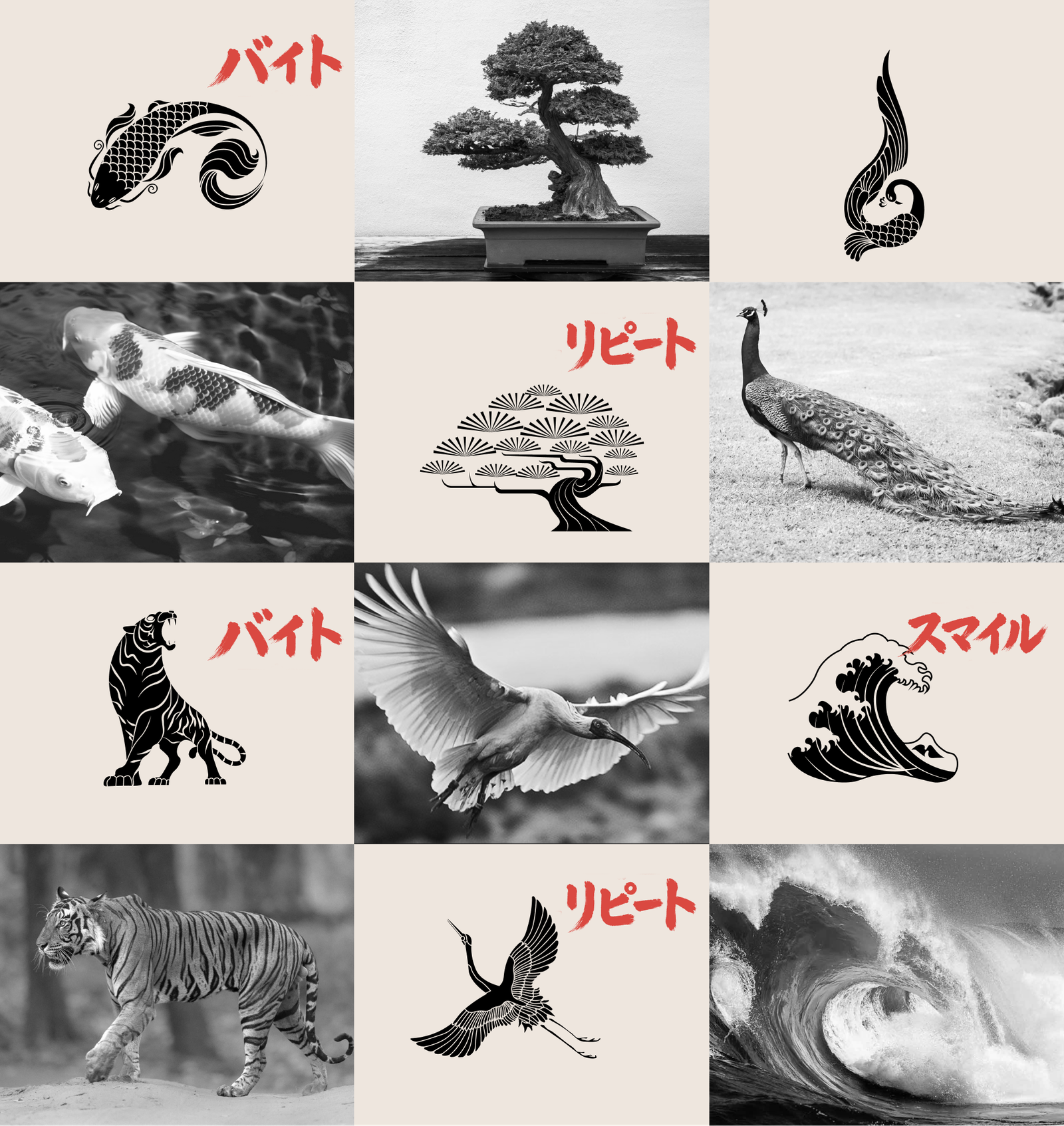
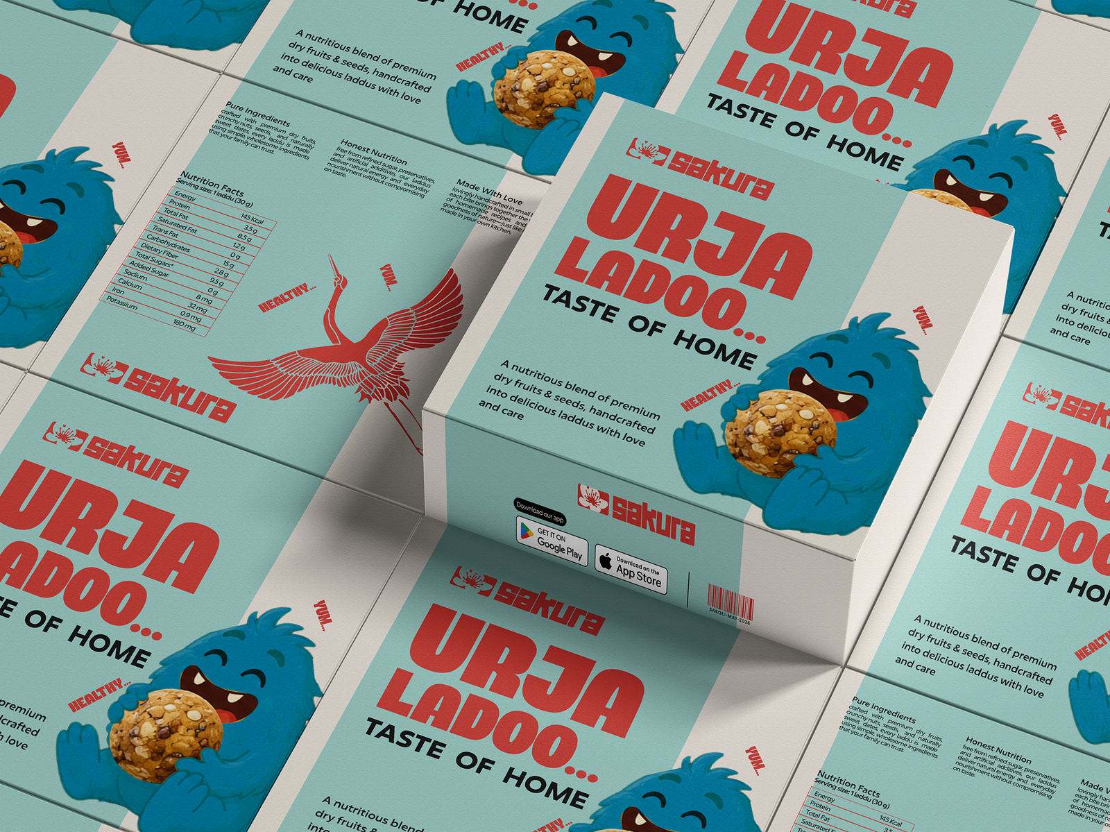
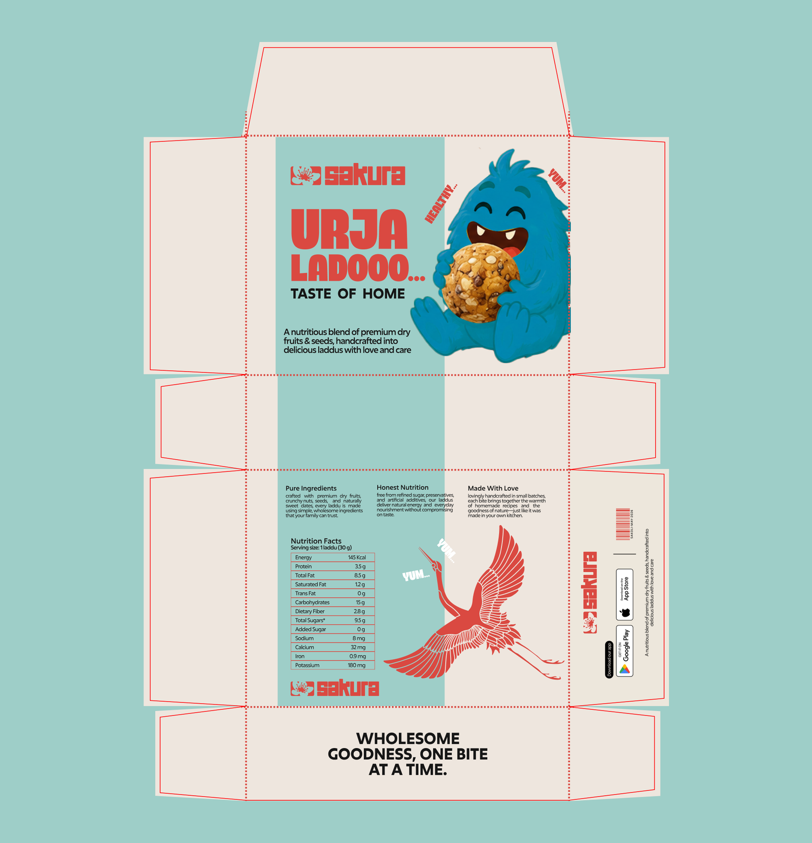
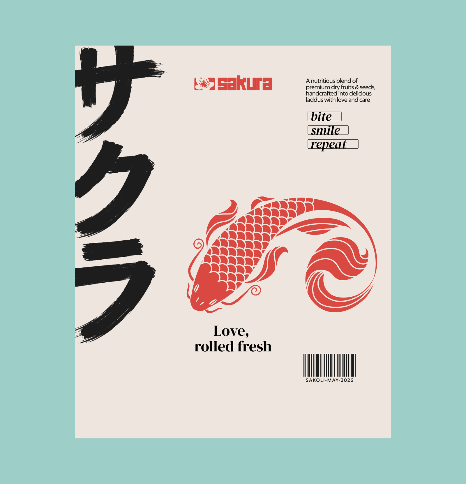
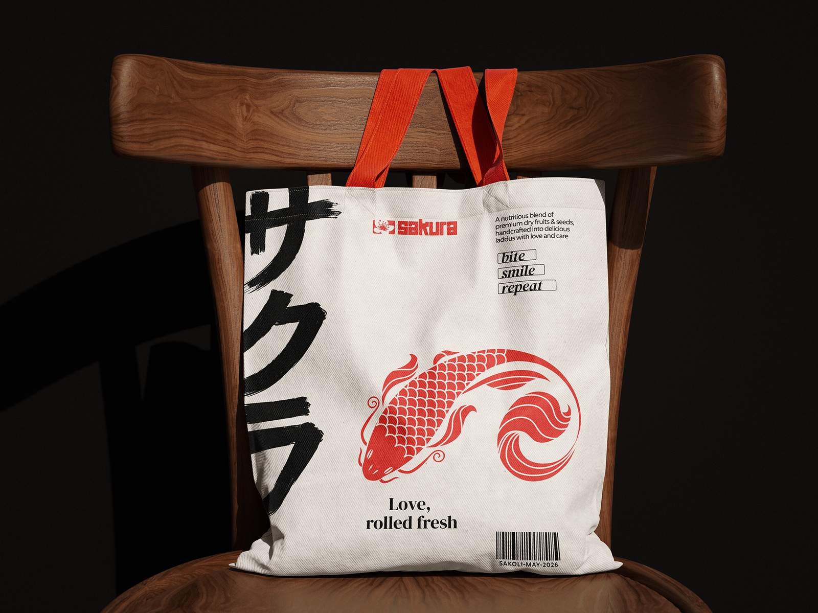
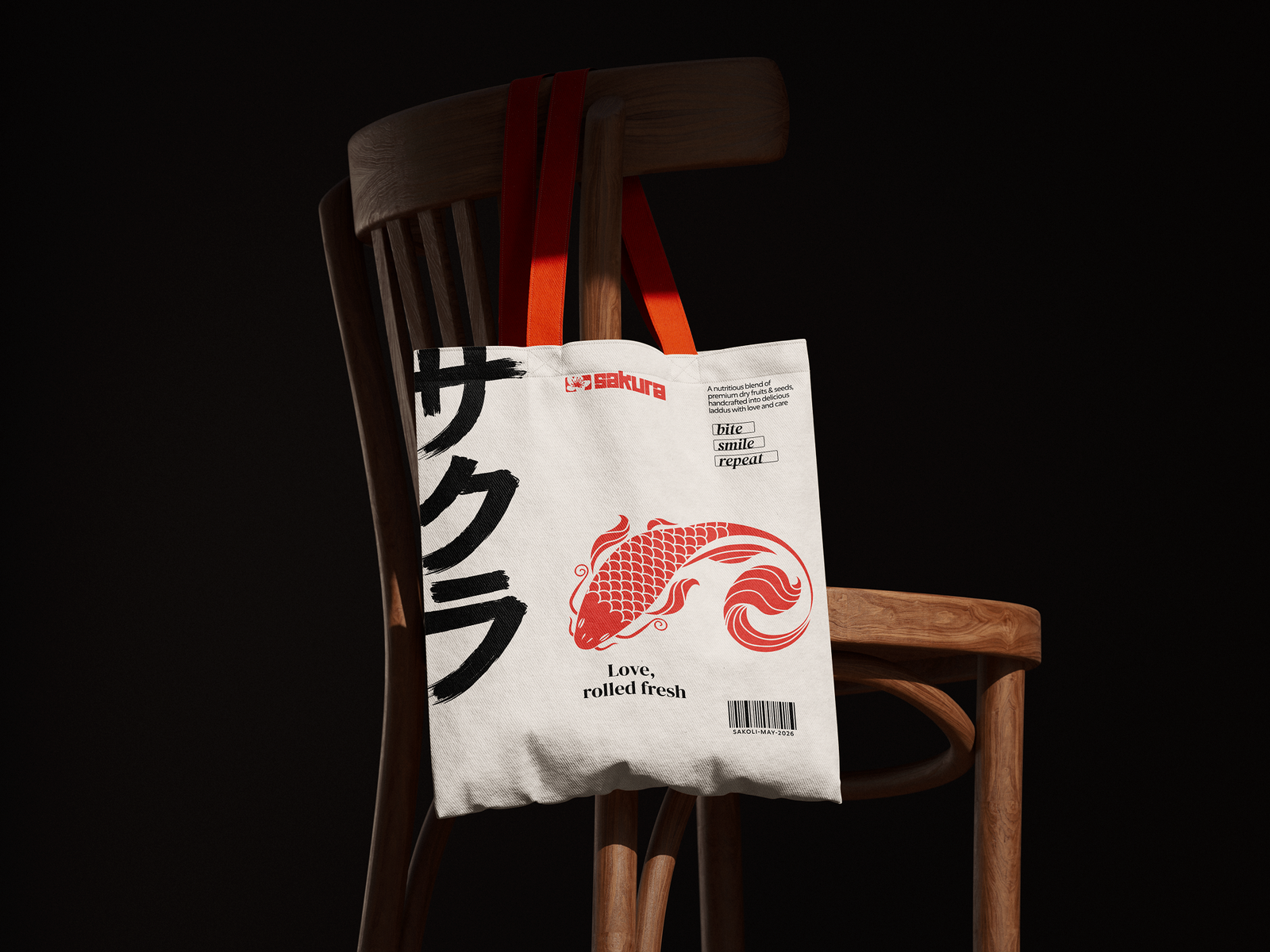
A friendly, memorable food brand with one visual language that holds together across packaging, retail shelf, and — eventually — a restaurant.